Mood Board Idea 2

Idea 2 Mood Board

So here is my second mood board for my IKEA project. It’s really hard doing a second mood board once you’ve already done one that you have feel in love with, but to be honest I really like this one, now that its done. When I started researching images for this mood board I never had any of these pictures they were all just spontaneous and quick last minute selections, but one I put them all together I started to realise a theme which remind my of industrial brick work type interiors.

Once I had gathered a few of the interior pictures I have in the mood board I realised it needed a dash of colour so I decided to keep it quite simple but still relating to my brief, I decided Autumn associated colours would be ideal because its that time of year where it starts getting a little cooler but yet its still sunny, which is the kind of feeling I get from an industrial theme with the greys from the pipes and electrics being the colder colours, and the red/browns from the bricks being the warmer colours reminding me of a big warm open fire.

I’m totally undecided on what mood board to use because I really do like both, but we’ll just have to wait and see how my design develops further.

IKEA Furniture Samples 1!

image

After completing my first mood board, my second task for the day was to go on to IKEA and look for furniture that would match my mood board in an interior.

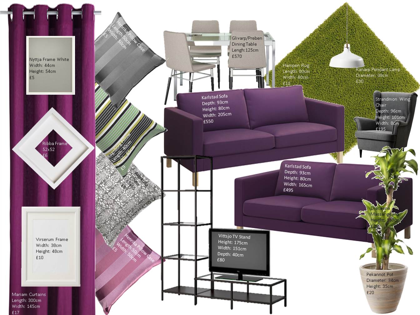
As I explained in my Mood Board 1 post, I had chosen to go for a green, purple and grey colour scheme! So trying to find furniture that was in these colours wasn’t as easy as you’d think, it turns out IKEA really like the colour white, which wasn’t really what I was looking for, however I did find some great pieces which meet my brief criteria and are the right colours which is a huge bonus!

I’m really happy with how my first idea has turned out, it needs a few minor tweaks here and there but other than that I think I’ve fell in love with this concept. Unfortunately though I have to come up with a second idea – as you always do – which is going to be tough, as it’ll be hard to get idea 1 out of my head, but I’m sure it’ll happen and be just as good if not, better!!

Posted from WordPress for Android

Mood Board Idea 1!

First sample mood board

We were given another task in college today to create a Mood Board for a live client. The short paragraph we were given about our client was as follows:

“Paul is 26 and works as a computer programmer he loves camping, climbing and cycling. Jane his partner 28, she is a teacher and also likes the outdoors”

They wanted a living room that was young, modern, fashion forward, clever with space and money, somewhere to bring friends, a place to call their own that has their identity. They are also described as socially and environmentally conscious.

I decided I wanted to do something pretty amazing and clever with the wall space so I found a few images on cdn.home-designing.com (10 unusual wall art ideas). I then went onto think about a colour scheme and liked the idea of using greens and greys – colours that I would say were quite subtle and relate well to what each of them like – however I started to think that there wasn’t enough colour, and with Jane being a teacher you would kind of think she was into a lot of colour, so I decided to add some purple as it contrasts well with the green but isn’t too over powering.

It’s a bit like Jenga!

I was doing some more research for my college class today on the train home when I came across this image on Google images:

image

At first I just thought it was wallpaper on the wall and didn’t really think it was a sustainable interior but saved it anyway as I quite liked the pattern. So I continued scrolling and I found the following image:

image

When I seen the image above I automatically thought it was familiar, it was then I realised that it was actually a close up of the first photo and it was from the same website; http://inhabitat.com/oktavillas-colorful-office-wall-is-made-of-stacked-recycled-magazines/

The images are of Oktavillas Advertising Agency in Stockholm Sweden, and was designed by Swedish architect Elding Oscarson. Over the years Oktavillas has collected thousands of magazines so it’s no wonder they were able to build an entire wall made of them. I love this design as it’s the first I’ve seen of its kind, I mean you type sustainable interiors into google and all you get is the inside of modern house’s  with an interior forest or water of some sort built in! Truely one of the best sustainable designs I’ve ever seen!

Posted from WordPress for Android

Plywood galore!

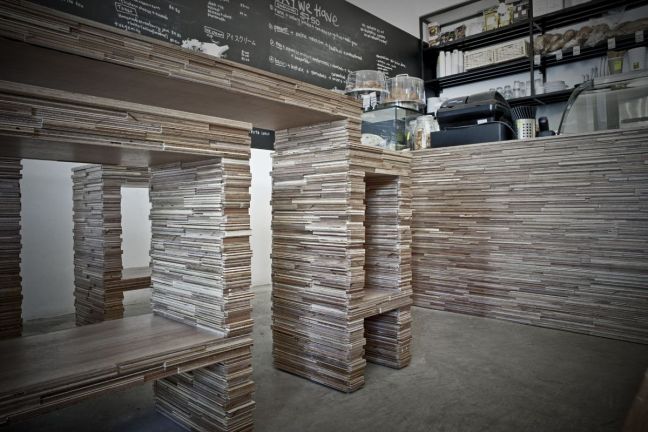
I found this awesome picture of a cafe in Singapore called The Kith Cafe:

image

Everything from the bar tops to the seats are made from plywood. I found the image on zeospot.com and the author of the article Nokki describes the cafe to have a classroom atmosphere,which I totally get. I think it’s because everything is so basic, the purpose of the design was that it wasn’t to have any mass produced chairs or tables, it was ment to just be a relaxing place where people could go for a coffee or good food in a simple place.

image

I think even having the whole menu written on blackboards adds to the classroom feel. The lighting helps incorporate the simplicity factor they were trying to get across aswell because it’s literally just light bulbs on a bit of wire, but thats all it needs because of the glass front which brings in a lot of natural sunlight.

I just love this design because I think it looks like a place that’s been set up in couple of hours as if it were a flat pack cafe which I think looks great because sometimes I feel as if all the coffee shops round here are huge franchises and all look the same and all have the same atmosphere which really bores me, I’d rather just have coffee to go. Where as if I were to go to this coffee shop I would quite happily sit there for hours! So on a whole this concept is a great example of a sustainable design!

Posted from WordPress for Android

Customized or upcycled?

So we’ve been given a task in college to create a blog for next Tuesday and we’ve to have at least 6 posts on sustainable or customised or upcycled furniture or interiors!

But I was talking to one of my classmates today and we struggled on how to define the difference between upcycling and customising, I had typed it into Google but I just kept getting businesses from all over the world, so I decided to look at the images it gave me, when I came across this one:

image

Its from a site called archinspired.org I think this looks mega! Definitely making the most of the space you’ve got to the max. I think this image interested me more inparticular because my mum has been talking about getting something like this installed under our stairs. I really like the idea of having the front faces as mirrors, just because I think it would save having a mirror hanging on the wall meaning there’s more room for paintings and photos, which if your house is anything like ours that’s a huge bonus!

So I think I have figured out the difference between upcycling and customising. Customising for example is like having a circular room and getting bespoke furniture to fit it exactly, where as upcycling is like painting chair legs or printing on a cushion.

Posted from WordPress for Android

Colour Co-ordinated Design!

imageI found this really amazing image on australiandesignreview.com the feature wall is located in the HaKa Building, an old abandoned shipbuilding warehouse from the 1930’s.  It’s now home to Doepel Strijkers Architects, every area is made from recycled materials from the reception area to the office space, and most of the construction and assembly was carried out by those that were in rehabilitation centres. But back to the wall, it’s referred to as the ‘acoustic wall’ and is made from repurposed and colour co-ordinated clothes. Now I’m a sucker for anything that’s colour co-ordinated or anything that’s in a specific order like alphabetical or by genre, so as soon as I saw this image I just had to read more about it!

If I had my own house this would definitely be something I would be installing in the near future, but unfortunately I don’t so I’m just going to have to admire the picture for a little while longer.

I think the overall concept of this idea is brilliant, I think that it works well as a barrier because it doesn’t look like a divider to separate workspaces, it just looks more like a piece of artwork. It also helps to break up the industrial feel to the building by incorporating something that makes you feel a little more like ‘oh wow!’ rather than ‘ugh…’

imageI was scrolling through my own personal Instagram earlier and came across this image which was posted by a site I follow freepeople, I’m not sure entirely what it is that they do or work in but they usually post some really great, vintage, chic photographs. As soon as I seen this though I was just like no way I’ve got to post this later. It’s amazing how, when you look at something online or someone tells you about something you suddenly seem to notice it in everyday life! EVERYDAY IS AN INSPIRATION!!

Colour co-ordination is definitely my inspiration for the day!

Bread Sticks!

imageAt a first glance you would think these tables were made from wood, but if you look closer it’s actually baguettes!! I was scrolling through google when I came across these funky, random looking tables, I was shocked at first when I noticed it was baguettes and all I kept thinking was ‘surely they must go mouldy after a few days!’  It’s a Polish company called Studio Rygalik that designed and produced them for Vienna Design Week calling it the ‘Bread Experience’ it was to show that our building materials are all around us and that all the food thrown away in Vienna could feed half the population of Graz! I mean I love this concept, I think the structure and the innovation is mind blowing but it’s not something I’ll be running out to buy anytime soon! 

Fork it up!

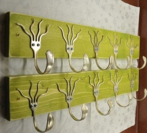
imageFound this awesome clothes hanger on homedesignplace.com.  It’s old forks that have obviously been bent to make them look like wee cool funky guys with crazy hair do’s!! I know the handles have suppose to be the hooks to hang stuff on but they remind me of tongues, I know it’s gross but it’s true. Mums got tons of old cutlery lying around the house might try this out for myself sometime.